If your video is getting impressions but barely any clicks, the problem might not be your topic or editing. It might be the packaging. That is why youtube thumbnail tips for beginners matter so much early on - a better thumbnail can change how people respond to the exact same video.
For new creators, thumbnails often feel like a design problem. They are really a viewer decision problem. Your thumbnail has one job: help the right person instantly understand what the video is about and feel curious enough to click. You do not need advanced graphic design skills to do that. You need clarity, contrast, and a little discipline.
Why thumbnails matter more than beginners think
On YouTube, viewers make fast decisions. They are scrolling through home feeds, search results, suggested videos, and subscriptions tabs without much patience. If your thumbnail looks crowded, vague, or low-effort, people move on before your title even gets a fair shot.
That does not mean every thumbnail needs to look dramatic or overproduced. It means your visual has to communicate quickly. A strong thumbnail can improve click-through rate, help YouTube identify the right audience response, and give your content a better chance to gather momentum.
There is a trade-off here, though. A thumbnail that chases clicks with exaggerated emotion or misleading imagery may get the first click, but it can hurt watch time and trust. Good growth is not about baiting viewers. It is about setting the right expectation and then delivering.
YouTube thumbnail tips for beginners that actually work
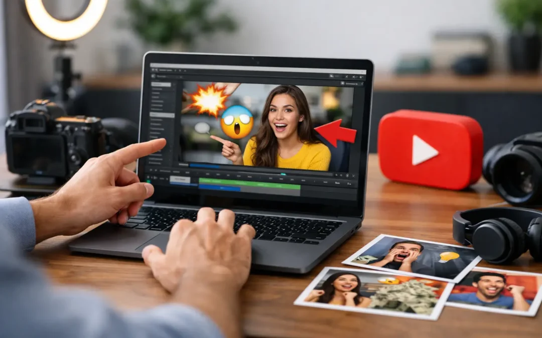
The fastest improvement most beginners can make is simplifying the frame. Many new creators try to say everything at once - title text, emojis, arrows, multiple screenshots, busy backgrounds, and too many colors. The result feels noisy.
Instead, build around one clear idea. If your video is about a camera setup, show the setup. If your video is about a transformation, show before and after. If your video is a tutorial, highlight the result the viewer wants. Strong thumbnails usually revolve around a single focal point.
Text can help, but only when it adds something the image cannot say alone. Keep it short. Three to five words is usually enough. On mobile, tiny text disappears, so use large lettering and avoid full sentences. If your title already explains the topic, your thumbnail text should create tension or reinforce the payoff, not repeat the title word for word.
Faces can work especially well because people are wired to notice expression. For beginners, this does not mean you must always put your face in every thumbnail. It depends on your niche and brand. In personal-brand channels, coaching channels, commentary, and many tutorial formats, faces often help. In software walkthroughs, product demos, or faceless educational channels, a clear visual result may perform better than a reaction shot.
Color contrast is another basic but powerful win. If your image blends into YouTube's interface or into competing thumbnails, it gets ignored. Use backgrounds and text colors that separate important elements. Bright does not always mean better. What matters is readability. A simple dark background with one bright subject can outperform a chaotic neon design.
Your composition matters just as much as your design choices. Shrink your thumbnail down and ask a hard question: can someone understand the concept in one second? If not, remove something. Most winning thumbnails feel obvious at small size. They are not clever in a hidden way. They are clear right away.
Design choices that help beginners look more professional
One of the smartest youtube thumbnail tips for beginners is to create a repeatable style before worrying about being original in every upload. Consistency builds recognition. When someone sees your videos repeatedly, a familiar color palette, text treatment, or framing style helps your channel look more established.
That does not mean every thumbnail should look identical. It means your videos should feel like they belong to the same creator. You might use the same font, similar color accents, or a recurring layout structure. A recognizable system saves time and makes your channel look intentional.
Image quality also matters more than many new creators realize. Blurry screenshots, dark photos, and low-resolution exports make a thumbnail feel amateur even when the video itself is useful. If you are using a still from your video, choose one with clean lighting and a strong expression or action point. If you are staging a custom thumbnail photo, take an extra minute to frame it properly. That small effort can lift the entire video package.
Be careful with visual clutter. Arrows, circles, outlines, and icons are not bad by default, but they lose power when overused. If every element is screaming, nothing stands out. Use emphasis only where it supports the main message.
Common thumbnail mistakes beginners should avoid
The most common mistake is designing for yourself instead of the viewer. You know what your video means, so your thumbnail may feel obvious to you. But a new viewer has no context. They need a fast signal about the topic, the outcome, or the intrigue.
Another mistake is making the thumbnail and title compete. The best pair works together. If your title says, "How I Grew My Channel From 0 to 1,000 Subscribers," the thumbnail does not need to repeat that full sentence. It could simply show "0 to 1K" with a strong visual. The goal is cooperation, not duplication.
Many beginners also copy large creators too literally. Inspiration is useful, but context matters. A massive creator can post a vague thumbnail because their audience already knows them. A smaller channel usually needs more clarity. Borrow structure, not just style.
There is also a temptation to redesign everything after one weak result. That can slow learning. One thumbnail underperforming does not always mean the design failed. Sometimes the topic had lower demand. Sometimes the title missed. Sometimes the audience was wrong for the video. Thumbnails matter, but they are part of a larger system.
How to test and improve over time
The best way to get better is to treat thumbnails as a skill, not a one-time task. Look at your own analytics and compare videos by topic, click-through rate, and audience response. You are not looking for a magic formula. You are looking for patterns.
Ask questions like these: Do videos with close-up subjects get more clicks? Do your educational videos perform better with cleaner text? Are your thumbnails too dark? Do your best-performing uploads promise a specific result instead of a general topic? Over time, these patterns become your style guide.
It also helps to sketch two or three thumbnail concepts before choosing one. This keeps you from locking into the first idea. Often the strongest version is the simplest one, but you usually see that only after comparing options.
If you have the ability to test thumbnail variations, use it thoughtfully. Change one major variable at a time - such as text, subject framing, or color contrast - so you can learn what actually influenced performance. Random changes create random lessons.
A simple beginner workflow you can use every time
Start with the video promise. Before opening any design tool, finish this sentence: the viewer will click because they want this result. That result should shape the thumbnail.
Next, choose one visual anchor. This could be your face, an object, a graph, a screen result, or a before-and-after comparison. Build around that anchor instead of adding multiple competing ideas.
Then decide whether text is necessary. If the image already communicates the concept clearly, skip the text. If the topic needs context, add a short phrase that sharpens the promise.
Before exporting, zoom out or preview it at a small size. If it loses meaning, increase contrast, simplify the layout, or cut extra elements. This final check catches many beginner mistakes.
For creators building seriously, this is where systems help. A basic thumbnail workflow, a saved template, and a habit of reviewing performance can make every upload stronger. That is often the difference between guessing and growing.
The goal is not perfect design
The goal is better response from the right viewers. A thumbnail does not need to be flashy, expensive, or overly polished to work. It needs to be clear, relevant, and aligned with the video promise.
If you are new to YouTube, give yourself permission to improve in public. Your first thumbnails will probably be weaker than your future ones. That is normal. What matters is building the habit of making intentional choices, reviewing what happens, and refining from there.
Smarter YouTube starts with better packaging. And once your thumbnails begin earning more clicks from the right audience, every good video you publish has a better chance to do the work it was meant to do.