If you have ever opened YouTube Analytics, looked at your audience retention chart, and thought, why is everyone leaving at 0:22, this YouTube retention graph explained guide is for you. The graph is not just a report card on one video. It is one of the clearest signals YouTube gives you about what viewers actually felt while watching.
For creators trying to grow, that matters more than vanity metrics. Views can tell you a video got clicked. The retention graph tells you whether it deserved the click.
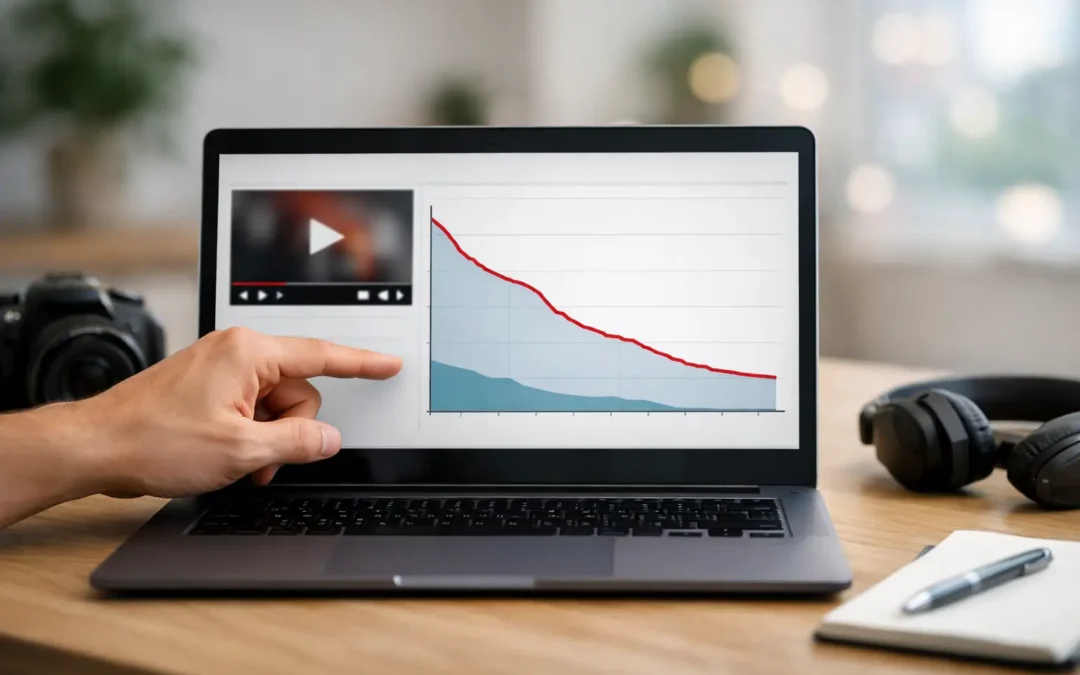
What the YouTube retention graph actually shows
At its core, the retention graph tracks how much of your video people continue watching over time. The line usually starts near 100% at the beginning and slopes downward as viewers leave. That part is normal. Almost every video loses viewers as it progresses.
What makes the graph useful is not that it drops. It is how it drops, where it spikes, and where it falls faster than expected. Those patterns help you diagnose problems with your intro, pacing, structure, editing, and even title-to-content alignment.
If your line falls sharply in the first 15 to 30 seconds, your opening probably did not validate the click fast enough. If it stays relatively steady through the middle, your structure is likely working. If it spikes at one point, viewers may be rewatching that section because it was especially useful, confusing, or emotionally strong.
In other words, the retention graph is audience behavior translated into a line.
YouTube retention graph explained by section
Most creators get more value from the graph when they stop looking at it as one big number and start reading it in phases.
The first 30 seconds
This is where a large share of viewers decide whether to stay. A steep drop here usually means one of three things. Your hook was weak, your intro was too slow, or the video did not quickly deliver what the title and thumbnail promised.
A lot of creators make the mistake of opening with branding, long greetings, or setup that delays the payoff. That might feel polite or professional, but viewers usually care more about momentum than formality. If someone clicked because they wanted an answer, they want proof right away that they are in the right place.
The middle of the video
This section reveals whether your pacing is strong enough to maintain attention once the initial curiosity fades. A healthy middle section often declines gradually. A sudden cliff usually points to a segment that dragged, repeated information, or took an unnecessary detour.
This is where structure matters. If your video moves cleanly from point to point, viewers tend to stay longer. If you ramble, over-explain, or insert unrelated tangents, the graph often shows the damage immediately.
The ending
The final portion helps you assess whether your closing holds interest or signals that the useful part is over. If viewers leave the moment you start wrapping up, your ending may feel disconnected from the main value. If retention stays steadier than expected, your ending is likely doing a good job extending relevance, reinforcing the takeaway, or transitioning into the next step.
For creators focused on watch time and session growth, a strong ending is not just nice to have. It can improve how viewers move from one video to the next.
How to read dips, spikes, and flat sections
Not every graph shape means the same thing. Context matters.
A dip usually means viewers lost interest or felt a section was unnecessary. That can happen when your intro runs long, your explanation gets repetitive, or the video shifts away from the promise that earned the click. Dips are common, but sharp dips deserve a closer look.
A spike often means viewers rewatched a specific moment. Sometimes that is great. It can mean you delivered a strong teaching point, a compelling reveal, or a memorable moment. Other times, it means the section was confusing and people had to replay it to understand what you meant. The only way to know which is true is to review the clip itself.
A flatter section is usually a good sign. It suggests viewers stayed engaged at a relatively stable rate. If you notice flatter retention during faster pacing, stronger storytelling, or clearer visuals, that gives you a repeatable pattern to use in future videos.
What a good retention graph looks like
There is no single perfect shape, which is where many creators get frustrated. A good retention graph depends on video length, topic, audience intent, and format.
A five-minute tutorial and a 30-minute commentary video should not be judged by the same standard. Shorter videos often need tighter pacing because viewers expect quick delivery. Longer videos can still perform well with lower percentage retention if they generate strong total watch time.
That is why it helps to compare your videos against your own channel patterns first. If one video retains viewers much better than your usual average, study it. What was different about the opening, structure, energy, or topic framing? Growth on YouTube often comes from repeating what already worked, not guessing from scratch every time.
The biggest reasons retention drops fast
Most retention issues are not random. They usually come back to a few familiar problems.
The first is a weak hook. If the opening does not create curiosity, clarify the value, or show progress quickly, viewers leave. The second is mismatch. If your title and thumbnail promise one thing but the video starts somewhere else, people feel misled and click away. The third is slow pacing. Long pauses, repeated points, and drawn-out explanations make even useful content feel harder to watch.
Another common issue is poor structure. Viewers stay longer when they can sense forward movement. They want to feel that each section earns the next one. If your video feels scattered, retention usually reflects that.
Production quality can matter too, but not always in the way beginners assume. You do not need cinematic gear to hold attention. Clear audio, readable visuals, and confident delivery often matter more than expensive equipment.
How to improve retention without making your videos feel robotic
The goal is not to manipulate viewers into staying. The goal is to make the video easier and more rewarding to watch.
Start by tightening your opening. Give the viewer a reason to care within the first few seconds. That might be a result, a problem, a bold claim, or a fast preview of what they are about to learn. Then move into the content before attention fades.
Next, look for sections where you can compress time. If a point takes 40 seconds to explain but could be explained in 20, cut it down. Better retention often comes from respecting the viewer's attention span.
You should also create clear transitions. When one section ends, signal where the video is going next and why it matters. This helps maintain momentum. Viewers are more likely to stay when they understand the path ahead.
Pattern interrupts can help as well. A change in camera angle, visual example, on-screen text, story beat, or pacing can reset attention. But this only works if it supports the message. Random editing tricks might hold attention briefly, but they can also feel forced if overused.
For educational creators, one of the most reliable retention improvements is showing rather than just telling. If you are explaining analytics, editing software, or a YouTube strategy concept, demonstrate it on screen. Practical visuals reduce friction and help viewers process information faster.
How retention connects to channel growth
Retention is not just about one video performing better. It shapes how YouTube interprets viewer satisfaction. When people keep watching, YouTube has stronger evidence that your video matched the click and delivered value.
That does not mean high retention guarantees viral reach. Topic demand, click-through rate, competition, and viewer history still matter. But poor retention makes growth harder because it suggests the content did not sustain interest.
This is why smart creators treat retention as a creative feedback loop, not just an analytics metric. It tells you where your content loses energy and where it gains momentum. Over time, that helps you make sharper decisions about hooks, editing, structure, and video format.
If you are still learning how to read YouTube analytics, Tubeskill's approach is the right one to borrow: use the data to guide your next creative choice, not to punish yourself for the last upload.
A practical way to review your next graph
After your next video has enough data, watch the retention graph while replaying the video itself. Mark the biggest early drop, the steepest mid-video decline, and any unusual spike. Then ask simple questions. Did I delay the payoff? Did I repeat a point? Did I get clearer or more engaging at this moment?
This matters because the graph alone cannot tell you why people behaved a certain way. It only tells you when. Your job is to connect that timing to the actual viewer experience.
The creators who improve fastest are usually not the ones obsessing over every decimal point. They are the ones who keep learning from the line, one video at a time, and turning that feedback into better content.