A strong video can still get ignored if the packaging is weak. That is why youtube thumbnail design tips matter so much for creators who want more clicks, stronger first impressions, and better performance across search, suggested videos, and home feed.
Thumbnails are not just decoration. They are a decision point. In a fraction of a second, a viewer decides whether your video looks relevant, credible, and worth their time. If your click-through rate is low, your thumbnail is one of the first places to look.
Why thumbnail design affects growth
YouTube is a competitive visual environment. Your video often appears beside larger channels, stronger brands, and louder designs. A thumbnail does not need to be flashy to win, but it does need to communicate clearly and quickly.
The goal is not simply to get clicks. The goal is to get the right clicks. If your thumbnail overpromises, you may pull in curiosity clicks that hurt watch time and viewer trust. If it is too vague, qualified viewers may scroll past. Good design sits in the middle - high interest, clear context, and accurate expectation.
This is where many creators get stuck. They think a better thumbnail means adding more text, more arrows, more colors, and more visual effects. Usually, the opposite works better. Simplicity is easier to process, especially on mobile, where most viewers will first see your content.
YouTube thumbnail design tips that improve clicks
1. Design for small screens first
If your thumbnail only looks good at full size, it is not finished. Most viewers will see it as a tiny image, often on a phone. That means fine details, small text, and cluttered layouts disappear fast.
Before you upload, zoom out. If the main subject is hard to identify in a small preview, simplify it. One face, one object, or one obvious visual idea usually performs better than a crowded scene with five competing elements.
2. Make one clear promise
Your thumbnail should answer one question immediately: what is this video about, and why should I care?
That promise can be a result, a problem, a transformation, or a surprising moment. But it should be singular. If your thumbnail tries to communicate tutorial, reaction, comparison, and personal story all at once, the message gets diluted.
For example, a thumbnail for a video about growing a new channel should focus on one angle such as getting first subscribers, fixing low views, or choosing a niche. Pick the strongest hook and build around it.
3. Use text only when it adds clarity
Text can help, but it is not mandatory. Some creators treat thumbnail text like a second title and end up cramming six to ten words into a tiny space. That usually hurts readability.
If you use text, keep it short. Three to five words is often enough. Bold, high-contrast words work best. The text should support the visual, not repeat the title word for word. If the image already tells the story, extra text may be unnecessary.
There is also a trade-off here. Text can boost clarity for educational content, but too much of it can make your design feel dated or overly promotional. Test both styles if your niche allows it.
4. Build contrast on purpose
Contrast is one of the fastest ways to make a thumbnail stand out. This includes color contrast, light versus dark, sharp foreground separation, and emotional contrast.
If your background is busy, your main subject gets lost. If your colors are all mid-tone, nothing grabs attention. Strong thumbnails usually make the focal point unmistakable through lighting, color, or composition.
A simple approach is to keep the background quieter and the subject brighter or more saturated. That does not mean every thumbnail should use neon colors. It means the important part should visually lead.
The visual elements that matter most
Faces and emotion
Human faces still work well because people are wired to notice expression. A clear emotional reaction can communicate tension, surprise, relief, skepticism, or excitement before a viewer reads anything.
But this depends on the niche. For personal brands, commentary channels, and tutorials, faces often help. For product demos, gaming, crafts, or screen-based education, a face is not always the strongest choice. Sometimes the result, tool, or transformation matters more.
If you do use your face, make it readable. Tiny expressions do not translate well. Crop tighter, improve lighting, and avoid awkward half-expressions that feel forced.
Color choices
Color helps recognition and hierarchy. It can also support brand consistency if you use a repeatable palette. But consistency should not become sameness. If every thumbnail uses the exact same colors, framing, and structure, your feed may start blending together.
A better approach is to keep one or two recurring visual cues while adjusting the color emphasis based on the topic. A video about mistakes might use stronger reds or darker tones. A tutorial about results might lean brighter and cleaner. The point is not to follow color psychology rigidly. The point is to match the visual tone to the content.
Composition and spacing
Good thumbnails give each element room to breathe. Crowding every corner with icons, labels, arrows, and screenshots usually lowers impact.
Use spacing strategically. Put the main subject where the eye lands first. Support it with one secondary element if needed. If text appears, place it where it does not fight with the face or focal object. Clean composition often looks more professional than elaborate editing.
Common thumbnail mistakes creators make
A lot of thumbnail problems are not design skill issues. They are decision issues.
One common mistake is designing before choosing the hook. If the video angle is weak or unclear, the thumbnail becomes a patch job. Start with the core promise first, then design around it.
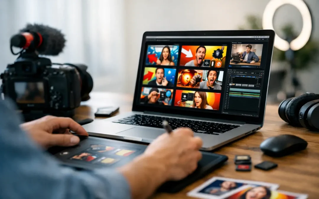
Another mistake is relying on screenshots that do not hold attention. A random frame from your video is rarely the best thumbnail unless the shot is unusually strong. Custom thumbnails give you more control over clarity, contrast, and emphasis.
Many creators also copy trends too literally. What works for a massive entertainment creator may not work for a small educational channel. Your thumbnail should fit your audience, your niche, and the kind of viewer you want to attract. Clickable is good. Misleading is expensive.
How to create a thumbnail workflow that saves time
The best youtube thumbnail design tips are not just about looks. They are also about process.
If thumbnail creation takes too long, you will either rush it or avoid improving it. A simple workflow helps. Start by writing two or three thumbnail concepts before you open any design tool. Then choose the one with the clearest promise.
Next, build from a repeatable layout. You do not need a rigid template for every video, but a familiar structure can speed things up. This might include a consistent text style, crop style, or color treatment.
After that, compare your thumbnail against competing videos on the same topic. Not to imitate them, but to check whether yours stands out or disappears. A thumbnail can look good on its own and still fail in the actual YouTube environment.
Finally, review performance. If a video gets impressions but underperforms on clicks, your thumbnail and title pairing may need work. If clicks are strong but watch time is weak, the thumbnail may be attracting the wrong audience. Growth comes from learning both sides.
Pair your thumbnail with the right title
Thumbnail and title should work together, not compete for the same sentence. If the title explains everything, the thumbnail has no job. If the thumbnail is vague and the title is also vague, viewers move on.
A better pairing creates curiosity with context. For example, the title can explain the topic while the thumbnail highlights the tension, result, or key visual. Think of them as a team. Each one should add something the other does not.
This matters even more for beginner and intermediate creators trying to improve click-through rate without drifting into clickbait. The stronger your message alignment, the easier it is to attract viewers who are actually interested in what your video delivers.
Test what works for your niche
There is no single thumbnail formula that works across every channel. Education, commentary, finance, beauty, gaming, real estate, and local business content all have different viewer expectations.
That is why testing matters. Notice patterns in your top-performing videos. Did tighter crops work better than wide scenes? Did thumbnails with fewer words outperform heavier text? Did your audience respond more to faces, results, or side-by-side comparisons?
Tubeskill encourages creators to think strategically here. Better thumbnails are not about guessing harder. They are about building a feedback loop between design choices and video performance.
A useful thumbnail does one job extremely well: it helps the right viewer stop scrolling. If you keep your message clear, your design simple, and your promise honest, your thumbnails will not just look better. They will start pulling more of their weight in your channel growth.